Sloppy Joe's - The era of AI Signage
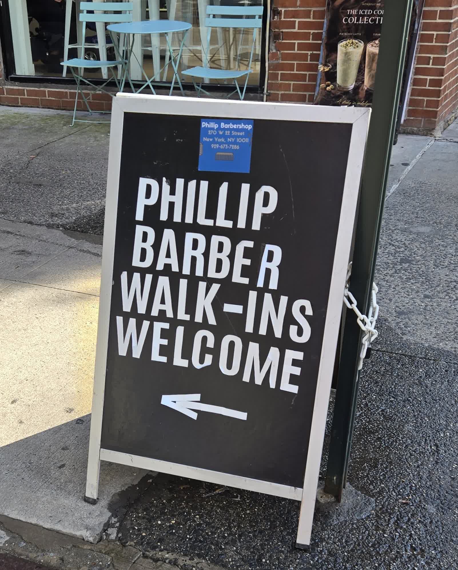
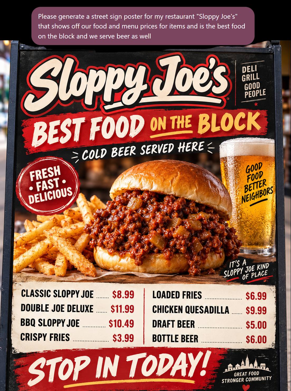
As I walk around my neighborhood in New York, each day I’m greeted with more and more signage that is clearly AI generated. The default style of ChatGPT signage is very standard - you can see how my Sloppy Joe version looks very similar to the ones spotted in the wild:
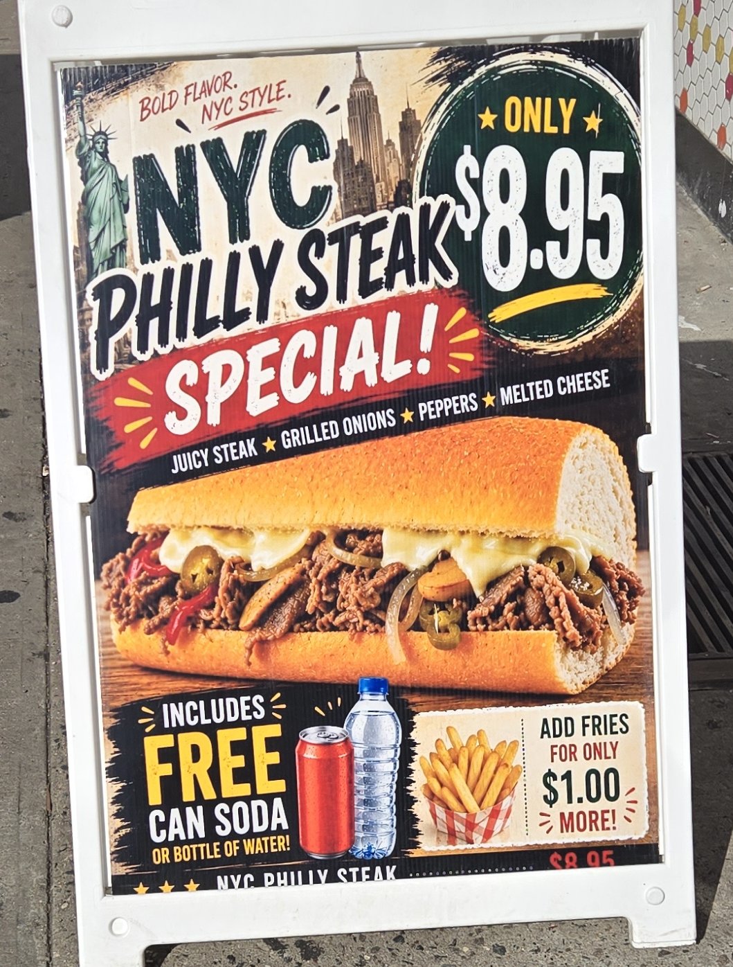
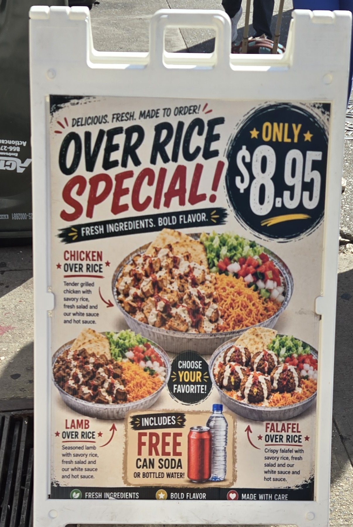
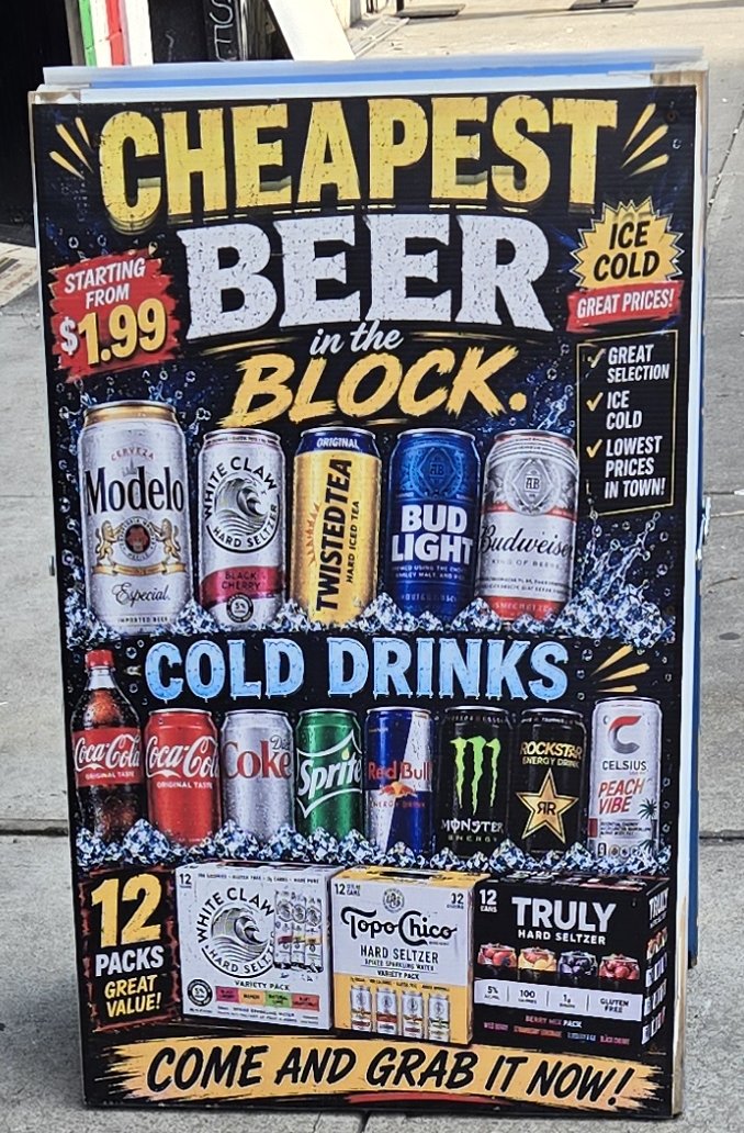
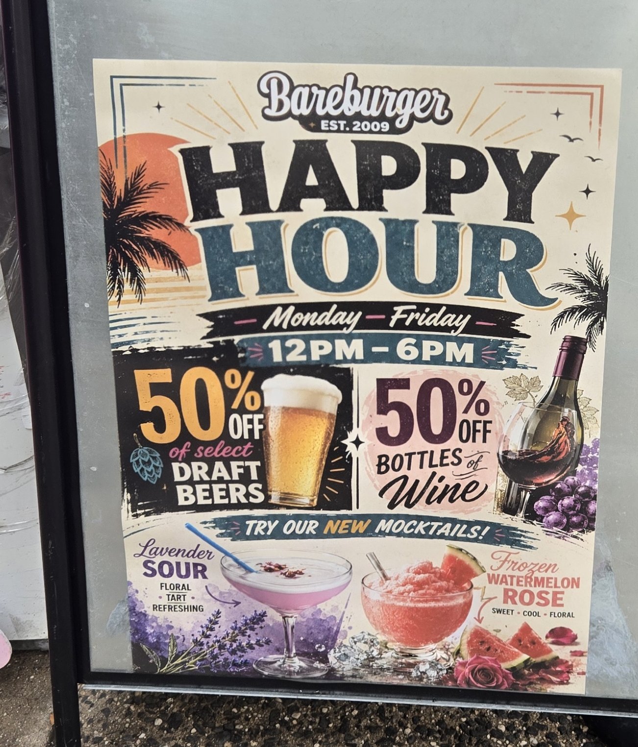
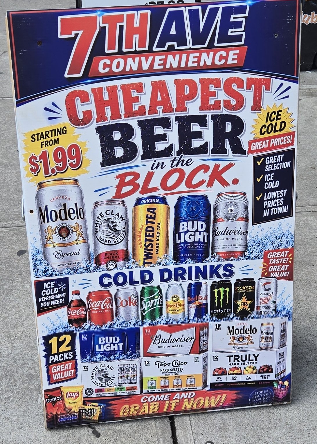
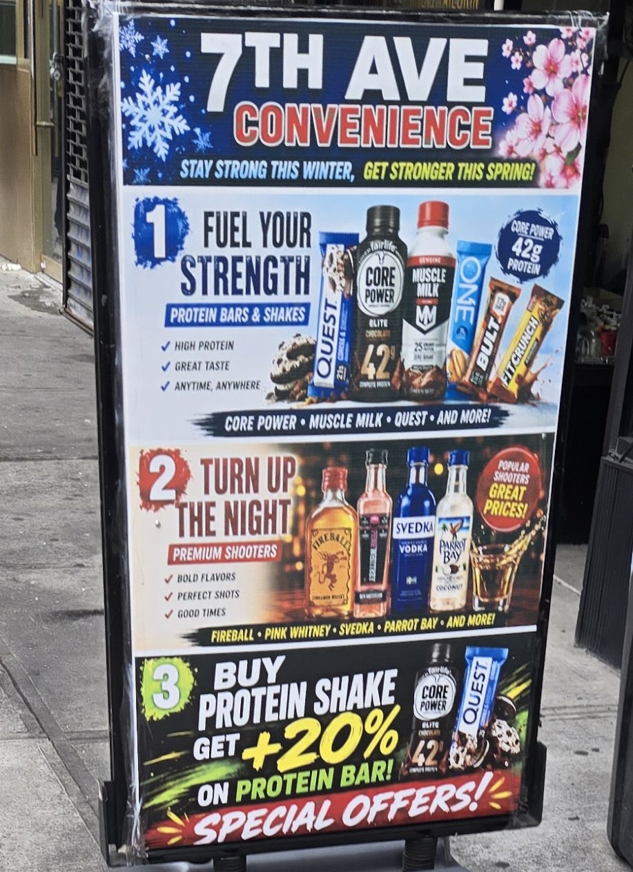
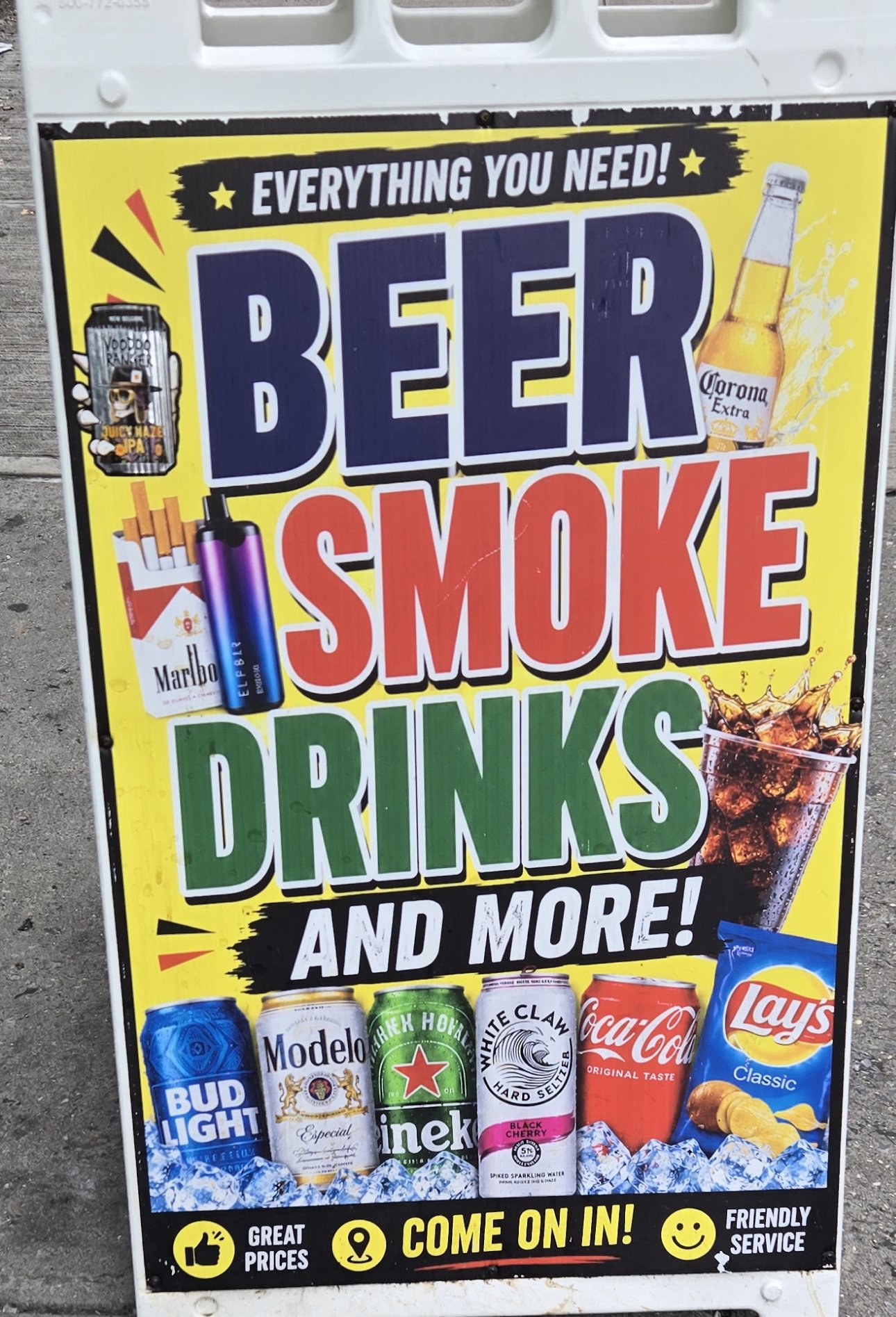
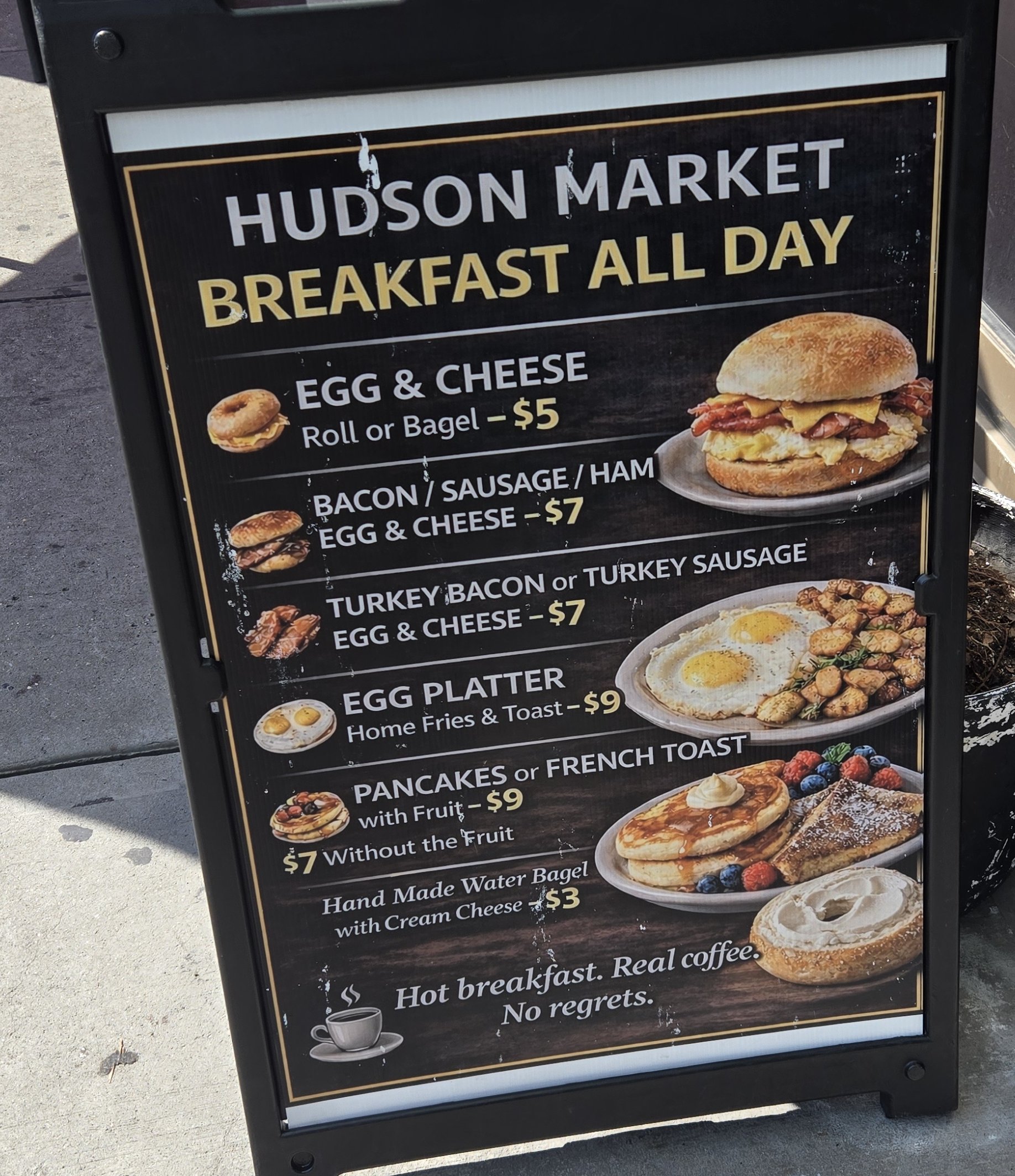
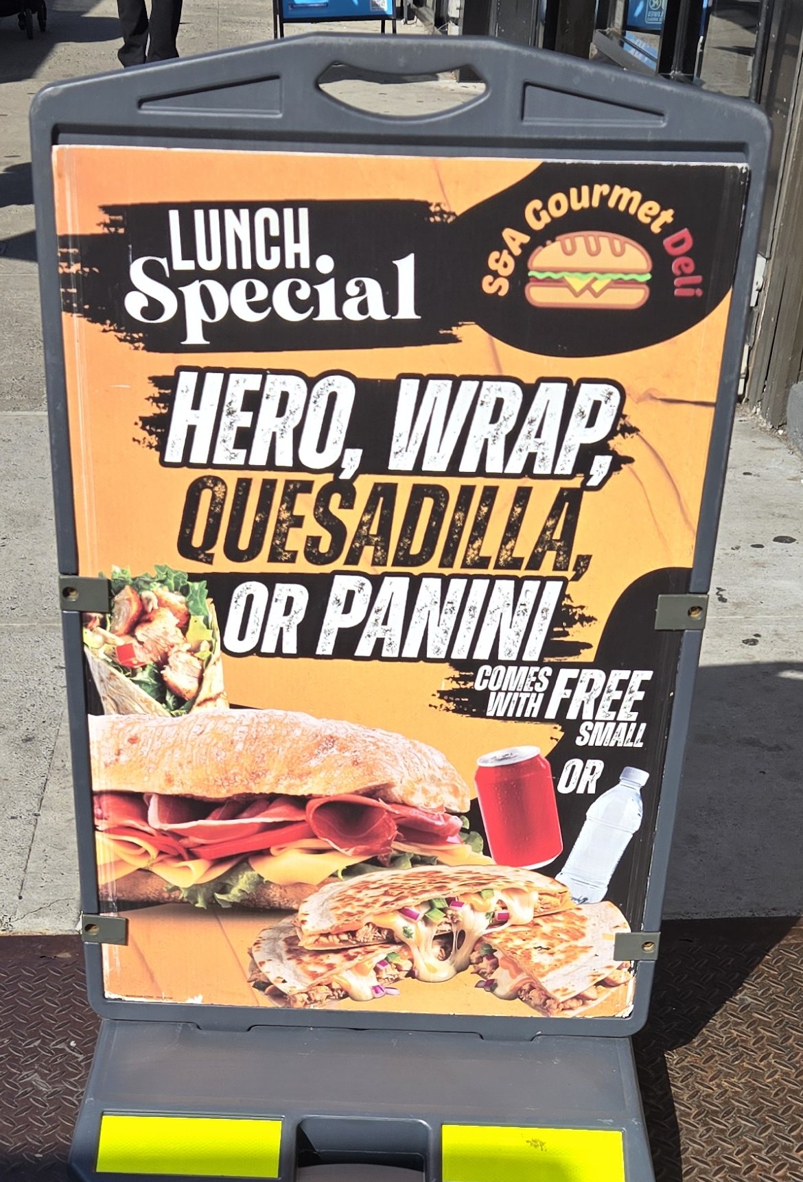
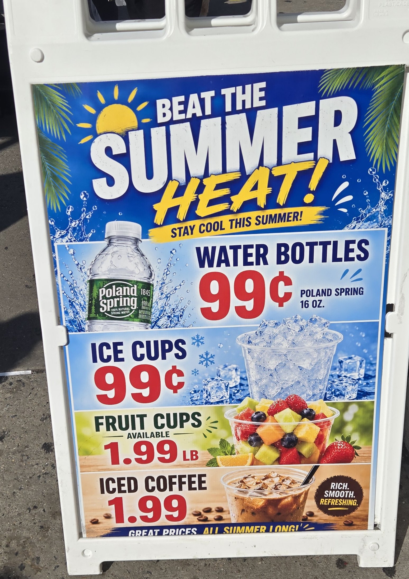
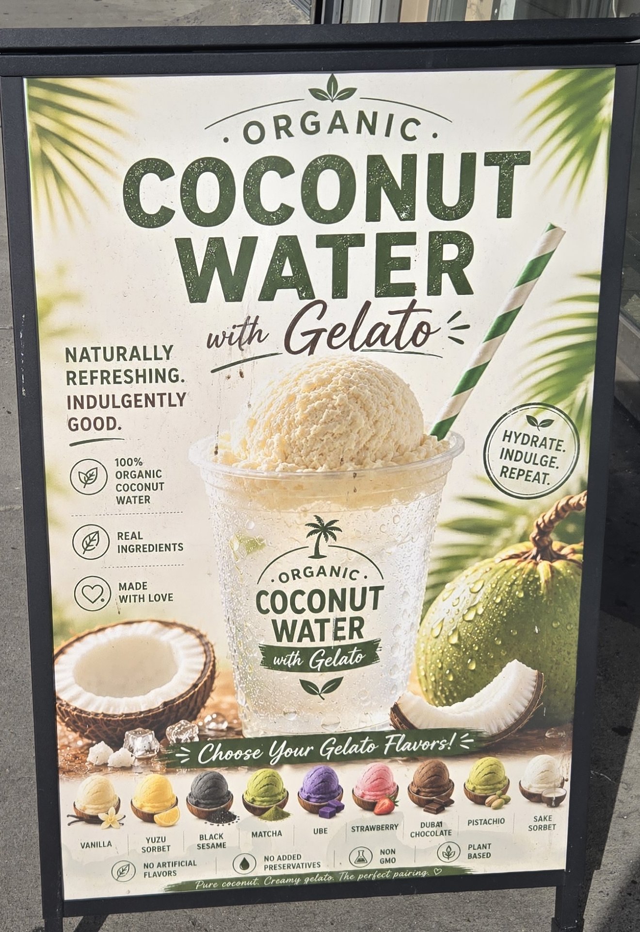
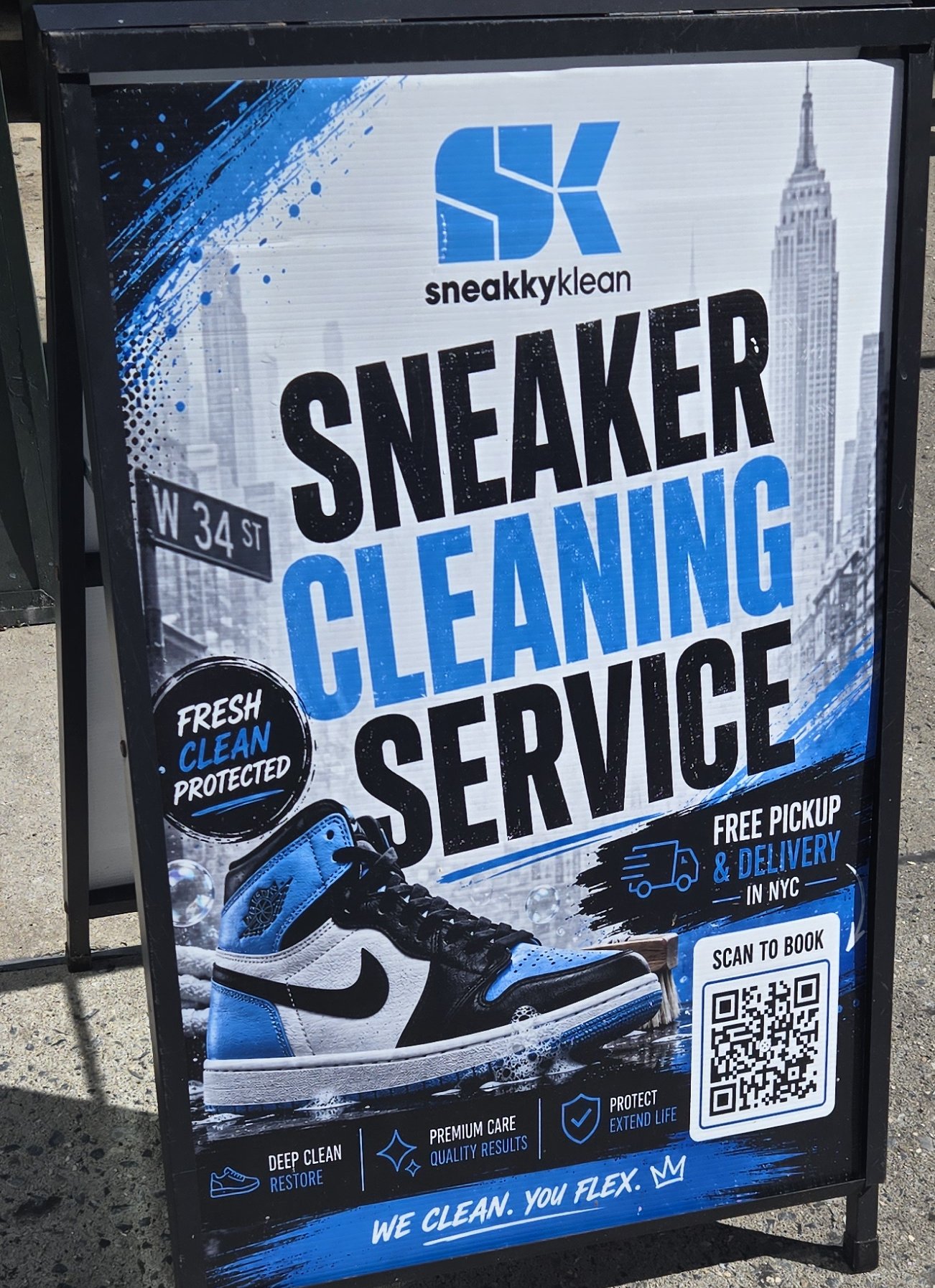
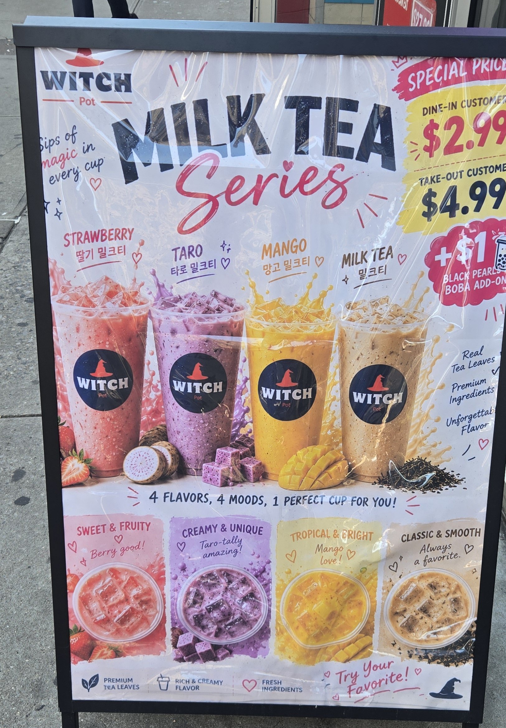
Some look better than others - but they share many tropes:
- Paint-stroke fonts, banners, and circles.
- Greebling, lots of little splats around key words
- Checkmarks, stars, and arrows galore
- A sort of bombastic eye-catching style that uses lots of colors
- Punchy three-phrase slogans or lists with little useless icons
- A made-up logo that is not found anywhere on the real store
The result is a sort of maximalist, garish sign that my brain has quickly learned to ignore. I recently wrote a bit about my feelings on AI generated art infesting our human world, so I won’t make a huge point of all this. These signs don’t matter much even when they’re human generated. But even when it comes to signage - I would rather read the prompt: